The simple plan to ‘tidy up’ SkiddMark’s website over Christmas got a little out of hand as I added more requirements to our list of improvements. You see, like any website the design and functionality of SkiddMark has evolved since the last redesign leaving an untidy mess of redundant code inside that was getting in the way of publishing stories.
It’s never easy redesigning your own website – I usually find myself building a site, changing the design completely and then rebuilding everything in some sort of endless spiral of death, continually tweaking, changing and replacing functionality that may have taken days to build.
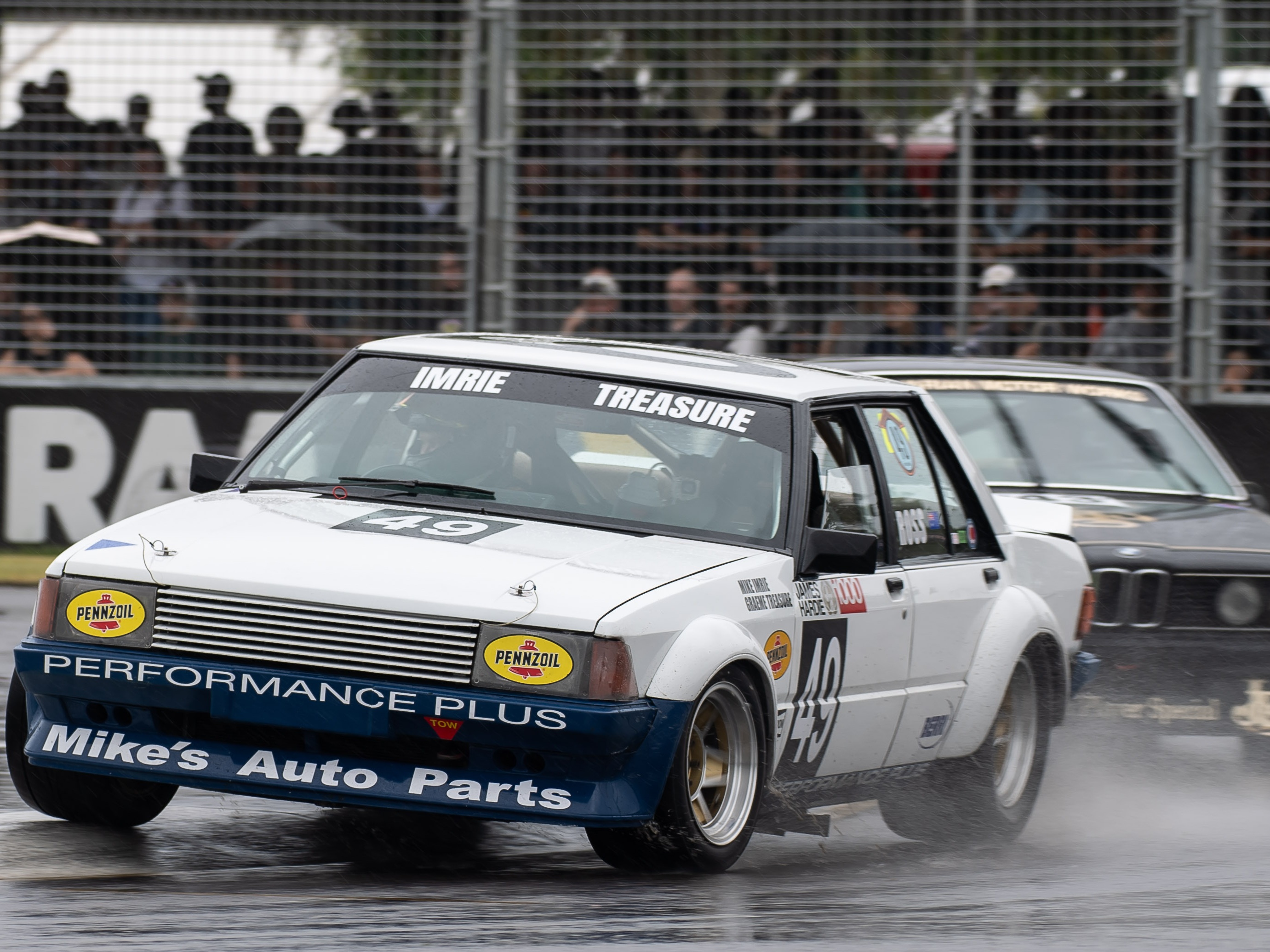
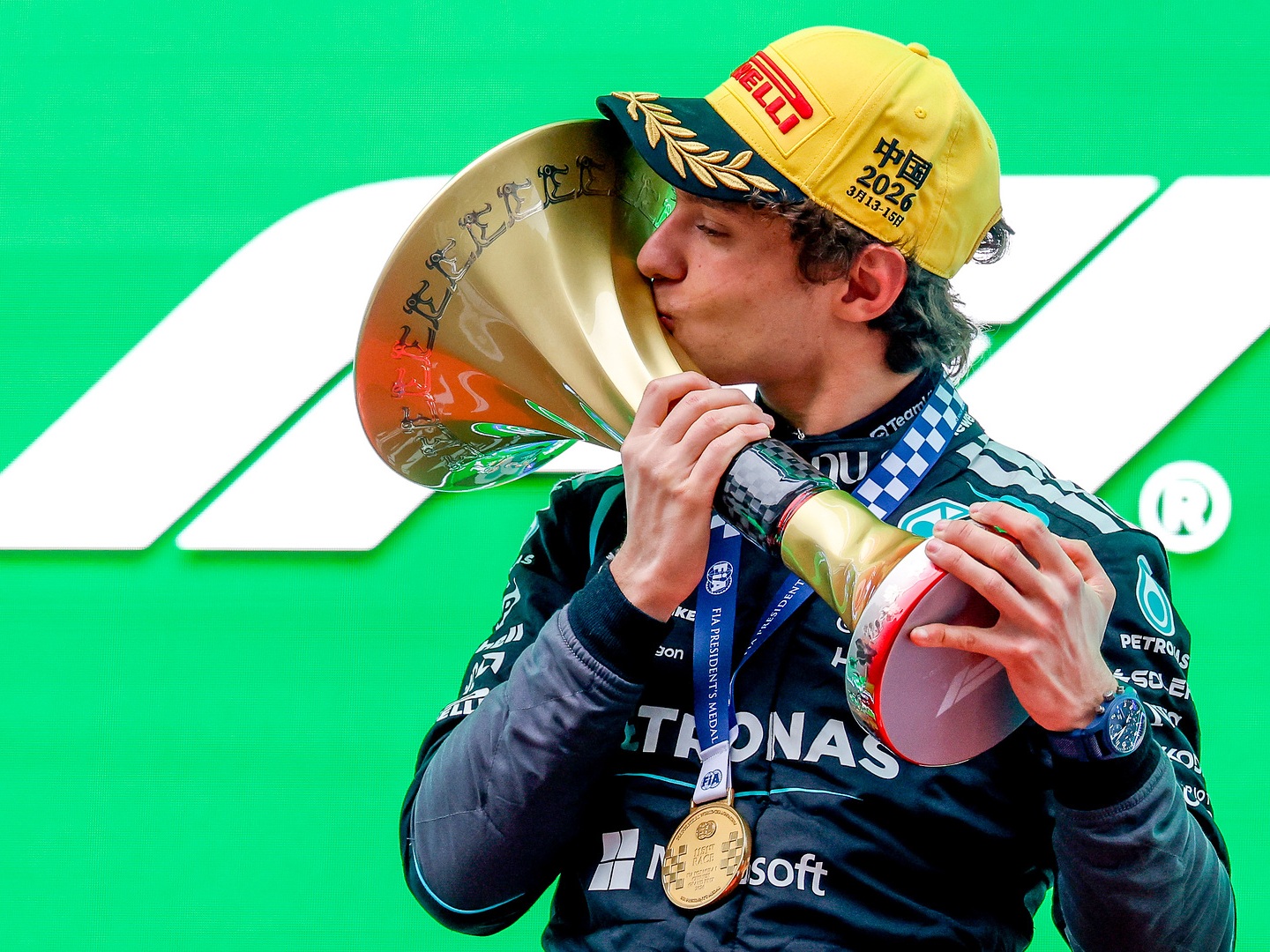
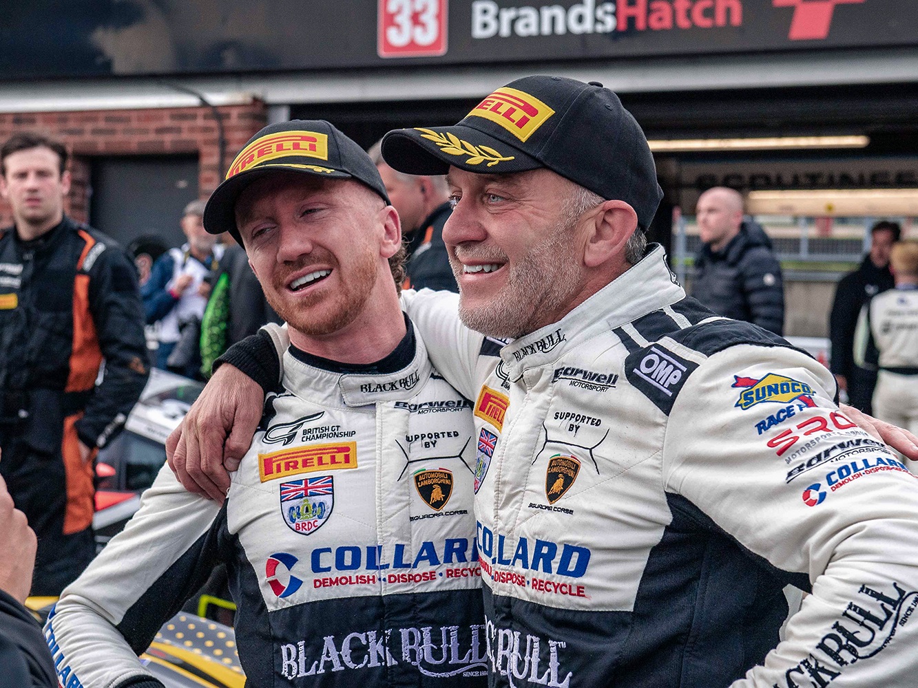
I’m well aware that a dark website is not to everybody’s taste, but that’s the style I adopted with Drivers Republic back in 2008 and I rather enjoy the challenge of making it work in an editorial environment rather than its more common use for portfolio sites. Besides, I’m a sucker for large colourful images and they always look best on a dark background.
We love our writers..
I had a number of objectives in mind during the redesign including giving greater prominence to our contributors.
I really wouldn’t enjoy SkiddMark half as much, if not for the reward I gain from getting into another writer’s shoes and seeing the world through their eyes.
I can’t thank the team enough for making it such a rewarding activity, so hopefully you’ll find it easier to understand the person behind each article and follow more of their activities outside of SkiddMark.
Responsive Design
For the interweb nerds amongst us, I’ll write a separate post about what’s under the hood. It still needs some fine tuning, but the basic principles I adopted were to embrace the latest HTML5 & CSS3 web standards, follow a document structure that is semantically(ish) correct and find out how far I could go in developing a responsive design.
Responsive designs are the latest cool thing in web development and involve designing a site with flexible dimensions, fluid images and a layout that adjusts to suit large and small devices by its use of CSS media queries. You can get an idea of what I mean if you look at SkiddMark on an iPad and then flip between horizontal and portrait orientations.
Although not a panacea for device independence, responsive websites make a whole lot more sense for publishers than native apps (on iOS/Android devices).
Apart from the obvious walled-garden limitation of native apps, modern HTML5/CSS3 websites can deliver virtually the same dynamic experience but take advantage of the “build once, deliver everywhere” principle that should be at the core of any digital-first strategy .
Content First
Another feature of our new design is its focus on usability, namely making it easy to find and view the content with the least distraction and the fewest number of clicks.
You’ll notice a little icon at the top of each article that enables you to remove all distractions (including ads) when reading an article. This is our ‘Content Only’ mode and is especially useful when reading long-form articles (which we tend to focus on here at Skiddmark).
I’ve taken the same approach with image galleries – when you’re viewing the gallery of images for a new car I’m assuming that’s pretty much the only thing you’d like to do at that moment, so the focus is on making this a proper lightbox experience, without any distraction from other content (or ads).
This is what I like to think differentiates Skiddmark from other sites, content comes first, we don’t believe in walled gardens and adverts, if they’re good enough to promote a brand, must also stand muster alongside editorial content – if not, then they don’t belong on the site.
Anyway… the new site is now launched and I hope you like it. I’ll update this post with details of other cool new features during the next week.
I’m a great believer in doing what you like, rather than second guessing other people’s tastes (which frequently change). I am sure it’s not to everyone’s taste but hopefully a few more people will enjoy what we have to offer.
Written By
Steve Davies
Steve is an investor, private equity advisor and former Partner at KPMG, PwC and Bain. � Most importantly he's a life-long car enthusiast, mountain biker and active sports enthusiast. He designs and builds technology platforms and is the architect behind Transmission.
Try These Next
Stories we think you'll enjoy